Basic Info
Most noticeable features
- Left & Right aligned menus are supported, and can be changed at any time during runtime. They’ll both scale with the safezone size automatically.
- If the screen resolution is too small, the menu will automatically display fewer items at a time to make sure it never goes off-screen. (note, very long item descriptions can still cause part of the menu to go off screen in rare cases)
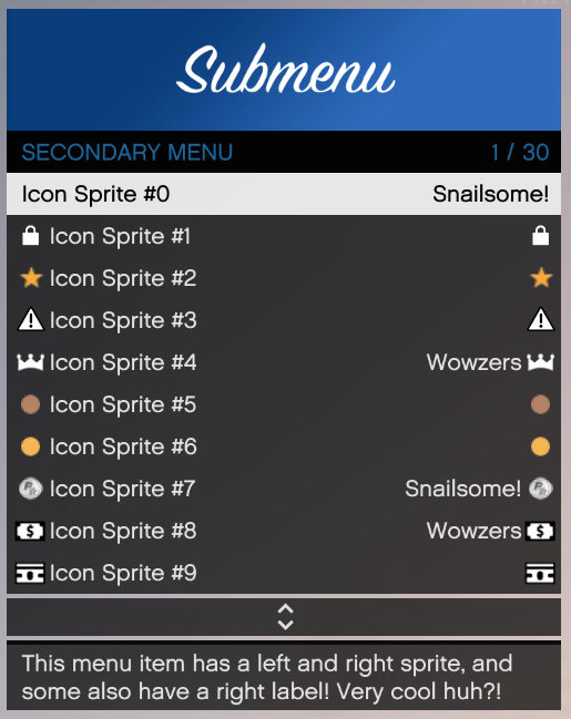
- Almost all menu items support left and right badges/icons.
- Menu items can have left and right text.
- Menu items can be disabled if you don’t want users to interact with them.
- The menu API handles all controls for you, you can choose your own menu toggle button if you prefer that. However, the controller keybind can not be changed and will always be set to back/select (default Interaction Menu toggle, hold it for 400ms to toggle the menu).
- Multiple checkbox designs supported.
- You can prevent users from exiting the menu using the normal ESC/backspace/cancel controls. (only do this for important menus where you need progress saved or something like that, and always have a button to exit the menu! Be nice to your users!)
Some examples
Here are some examples of what you can expect to be able to achieve with this API (if you put some time into it). Most of these screenshots are taken from vMenu after it was converted to this MenuAPI. Some are taken from the example menu provided with MenuAPI.
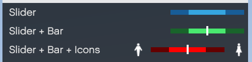
Optionally you can also choose from 29 different sprites to appear on either side of the slider.
You can also disable the instructional buttons all together if you want to handle that yourself.
Instructional buttons instantly update if the user switches between keyboard/mouse and controller.

You can also use icons even when you have text on the right side of an item, the text will move over for your icon automatically.