
MenuSliderItem
MenuSliderItem
Section titled “MenuSliderItem”A menu item with a slider on the right.
Example usage
Section titled “Example usage”// Creating 3 sliders, showing off the 3 possible variations and custom colors.MenuSliderItem slider = new MenuSliderItem("Slider", 0, 10, 5, false);
MenuSliderItem slider2 = new MenuSliderItem("Slider + Bar", 0, 10, 5, true){ BarColor = System.Drawing.Color.FromArgb(255, 73, 233, 111), BackgroundColor = System.Drawing.Color.FromArgb(255, 25, 100, 43)};
MenuSliderItem slider3 = new MenuSliderItem("Slider + Bar + Icons", "The icons are currently male/female because that's probably the most common use. But any icon can be used!", 0, 10, 5, true){ BarColor = System.Drawing.Color.FromArgb(255, 255, 0, 0), BackgroundColor = System.Drawing.Color.FromArgb(255, 100, 0, 0),
SliderLeftIcon = MenuItem.Icon.MALE, SliderRightIcon = MenuItem.Icon.FEMALE};
// adding the sliders to the menu.menu.AddMenuItem(slider);menu.AddMenuItem(slider2);menu.AddMenuItem(slider3);Example preview
Section titled “Example preview”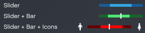
Reacting to a slider
Section titled “Reacting to a slider”MenuSliderItem volume = new MenuSliderItem("Volume", 0, 10, 5, true);menu.AddMenuItem(volume);
// Fires every time the slider moves.menu.OnSliderPositionChange += (_menu, _sliderItem, _oldPosition, _newPosition, _itemIndex) =>{ if (_sliderItem == volume) { SetVolume(_newPosition / 10f); }};
// Fires when the user presses select on the slider.menu.OnSliderItemSelect += (_menu, _sliderItem, _sliderPosition, _itemIndex) =>{ Debug.WriteLine($"Slider pressed at position {_sliderPosition}.");};Constructors
Section titled “Constructors”MenuSliderItem(string name, int min, int max, int startPosition)
Section titled “MenuSliderItem(string name, int min, int max, int startPosition)”Creates a slider without a description and without the divider line.
Parameters
Section titled “Parameters”| Parameter | Type | Description |
|---|---|---|
| name | string | The text displayed on the left side of the item. |
| min | int | The minimum slider position. Must be 0 or higher, and lower than max. |
| max | int | The maximum slider position. Must be higher than min. |
| startPosition | int | The position the slider starts at. Should be between min and max (inclusive). |
MenuSliderItem(string name, int min, int max, int startPosition, bool showDivider)
Section titled “MenuSliderItem(string name, int min, int max, int startPosition, bool showDivider)”Creates a slider without a description.
Parameters
Section titled “Parameters”| Parameter | Type | Description |
|---|---|---|
| name | string | The text displayed on the left side of the item. |
| min | int | The minimum slider position. |
| max | int | The maximum slider position. |
| startPosition | int | The position the slider starts at. |
| showDivider | boolean | Whether to draw the white divider line in the middle of the slider. |
MenuSliderItem(string name, string description, int min, int max, int startPosition)
Section titled “MenuSliderItem(string name, string description, int min, int max, int startPosition)”Creates a slider with a description and without the divider line.
Parameters
Section titled “Parameters”| Parameter | Type | Description |
|---|---|---|
| name | string | The text displayed on the left side of the item. |
| description | string | The description shown below the menu while this item is selected. |
| min | int | The minimum slider position. |
| max | int | The maximum slider position. |
| startPosition | int | The position the slider starts at. |
MenuSliderItem(string name, string description, int min, int max, int startPosition, bool showDivider)
Section titled “MenuSliderItem(string name, string description, int min, int max, int startPosition, bool showDivider)”Creates a slider with all options set.
Parameters
Section titled “Parameters”| Parameter | Type | Description |
|---|---|---|
| name | string | The text displayed on the left side of the item. |
| description | string | The description shown below the menu while this item is selected. |
| min | int | The minimum slider position. |
| max | int | The maximum slider position. |
| startPosition | int | The position the slider starts at. |
| showDivider | boolean | Whether to draw the white divider line in the middle of the slider. |
Properties
Section titled “Properties”| Property | Type | Default value | Description | Optional |
|---|---|---|---|---|
| Min | int | 0 | The minimum slider range, value must be an integer equal to or higher than 0, but less than the Max parameter. | No |
| Max | int | 10 | The maximum slider range, value must be an integer higher than the min value. | No |
| ShowDivider | boolean | false | Whether or not to show the white divider line in the middle of the slider. | Yes |
| Position | int | 0 | The default slider position, value must be an integer between the Min and Max value (inclusive). | No |
| SliderLeftIcon | Icon | Icon.NONE | An icon to show on the left side of the slider. | Yes |
| SliderRightIcon | Icon | Icon.NONE | An icon to show on the right side of the slider. | Yes |
| BackgroundColor | System.Drawing.Color | System.Drawing.Color.FromArgb(255, 24, 93, 151) | The slider background color. | Yes |
| BarColor | System.Drawing.Color | System.Drawing.Color.FromArgb(255, 53, 165, 223) | The slider bar color. | Yes |
Methods
Section titled “Methods”There are no methods available for MenuSliderItems.